


Choosing paint colours for your home sounds simple until you actually start doing it. Suddenly, every shade feels confusing. Every room feels different. And every colours seems to look better on the paint chart than it does on your wall.
This is where your journey with colour begins, and we at White Metal are thrilled to guide you through it. Think of us as your friendly neighbourhood experts, here to share simple, practical tips to fill your space with confidence and beauty.
Why Choosing The Right Paint Colour Truly Matters?
The right colour can make your compact apartment feel airy and open, or your spacious villa feel cozy and intimate. It’s the most impactful, cost-effective change you can make. And here’s a secret: the quality of your paint matters just as much as the colour.
The right Colour can turn your home into a peaceful place where you love to spend time. It can enhance your interior design and bring a sense of harmony to your daily life.
First, Understand Your Interior Style
Before you pick a single shade, look around. What story do you want your home to tell? Are you drawn to clean, minimalist lines? That’s a nod to modern styles. Do you love warm, earthy textures and intricate patterns? Perhaps your heart leans toward a more Arabic-inspired aesthetic. Your style is your compass. Your Colour choices should flow from it, creating harmony in every room.
Consider Lighting
This is the big one! Our gorgeous, abundant sunlight is glorious, but it dramatically changes colours. A soft beige can look stark at noon and golden at sunset. North-facing rooms get cooler, consistent light, while south and west-facing rooms get intense, warm light all afternoon.
Our tip: Always look at your paint sample at different times of day. And remember, artificial lighting is key. Those warm LED bulbs will warm up a grey, while cool white bulbs can make a room feel crisp. Observe your room’s light personality before you commit.
Pick Colours Based On The Room’s Purpose
Each room in your home has a purpose, and colour can support that.
Living Rooms: Warm neutrals, soft greens, or welcoming earthy tones encourage conversation and relaxation.
Bedrooms: Calming blues, gentle lavenders, or soothing, warm greiges, sage green promote rest and recharge.
Kitchens & Dining Areas: Whites for cleanliness, cheerful yellows for warmth, or even deep blues for a touch of drama can work beautifully.
Home Offices: Greens are known for concentration, soft blues for calm productivity, or light neutrals to avoid distraction.
Kids’ Room: Choose cheerful and playful shades. Soft teal, warm peach, or pastel violet can make the room feel lively without overwhelming the senses.
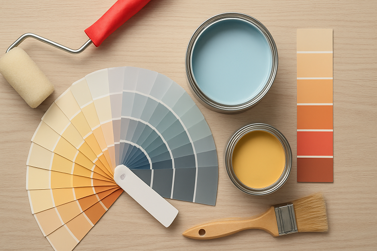
This Step Is Non-Negotiable: Test Paint Samples!
Never choose a Colour directly from the chart. Always test it on your wall first.
Why this matters:
• The paint looks different on your wall compared to the paint brochure
• Lighting changes the appearance of each shade
• Texture and wall quality can also impact the final look
Create A Cohesive, Balanced Colour Palette
Your home should feel like a journey, not a jarring jump between unrelated spaces. Choose a whole home palette. Pick a dominant colour for main areas, a secondary Colour for accents in connecting spaces, and an accent colour for drama. Use a consistent trim colour, like a crisp white to tie everything together neatly.
Trendy Vs. Timeless: What Serves You Best?
That bold, trendy colour on social media is tempting! But ask yourself: Will I love this in three years? Often, using trendy colours in smaller doses, like on an accent wall, through décor, is smarter. For your main walls, timeless neutrals, soft whites, and understated tones give you a flexible canvas. Your decor can then be as trendy or classic as you like, season after season.
• Trendy colours: Terracotta, mustard, emerald green, and deep navy are very popular today. They create a stylish statement.
• Timeless colours: White, beige, light grey, cream, and taupe never go out of style. These are perfect if you want a long-lasting option.
Common Mistakes to Avoid When Choosing Colours
• Avoid selecting a Colour because it looks good in someone else’s home
• Always sample paint instead of choosing from a tiny chip
• Check undertones carefully as colours can shift in your lighting
• Avoid choosing too many colours
• Avoid forgetting the furniture and decor
• By avoiding these mistakes, you save money, time, and effort.
Conclusion
Choosing your home’s Colours should be an exciting adventure of self-expression. It’s about creating a backdrop for your life’s best moments. Start with your feeling, respect the unique UAE light, test diligently, and choose quality paint that protects your investment and looks stunning day after day. With the UAE’s unique lighting, climate, and interior preferences, selecting the perfect Colour requires experience and understanding.
If you want a beautiful home with perfectly selected paint Colours, let us help you. Contact White Metal today for professional wall painting services in UAE, expert Colour consultation, and complete interior painting solutions. Your dream home is just one call away.